Browser.html is a speculative browser for nightly builds of Servo based on trails.


Responsibilities
Research, prototyping, communication.
Client
Mozilla Research
Timeframe
Eleven months
08.2016 - 07.2017
The goal of trails is to construct not only a window into web content but a narrative of user activity.

Current browsers
History does not show the path to the result.

Real path
We search in a linear way, we think by association.

Browser.html
Trail tells a self-contained story from left to right.
Each row represents a trail from the root of the navigation tree to a result.
If you ignore the paths leading up to each explored topic, trails are no different from conventional tabs. This is intentional: our goal is to enhance existing user experiences, not to replace them.
Read full storyHeader expansion
I was prototyping shortcuts to relevant pages straight in the header.
Trails
Duplicates lead to a lot of distracting visual noise. That can be removed by focusing on a single trail while folding the others.
Right click
Testing another possibilities of switching trails and utilizing contextual menu trigger with right-click.
𝔣𝔩𝔞𝔨𝔦
@slsoftworksDevRel & Community @mozilla
Should any of you been wondering — @ServoDev's browser.html frontend/UI is frickin amazing. 😱⚡🎉
There, now y'all know. 🤓
#mozAloha

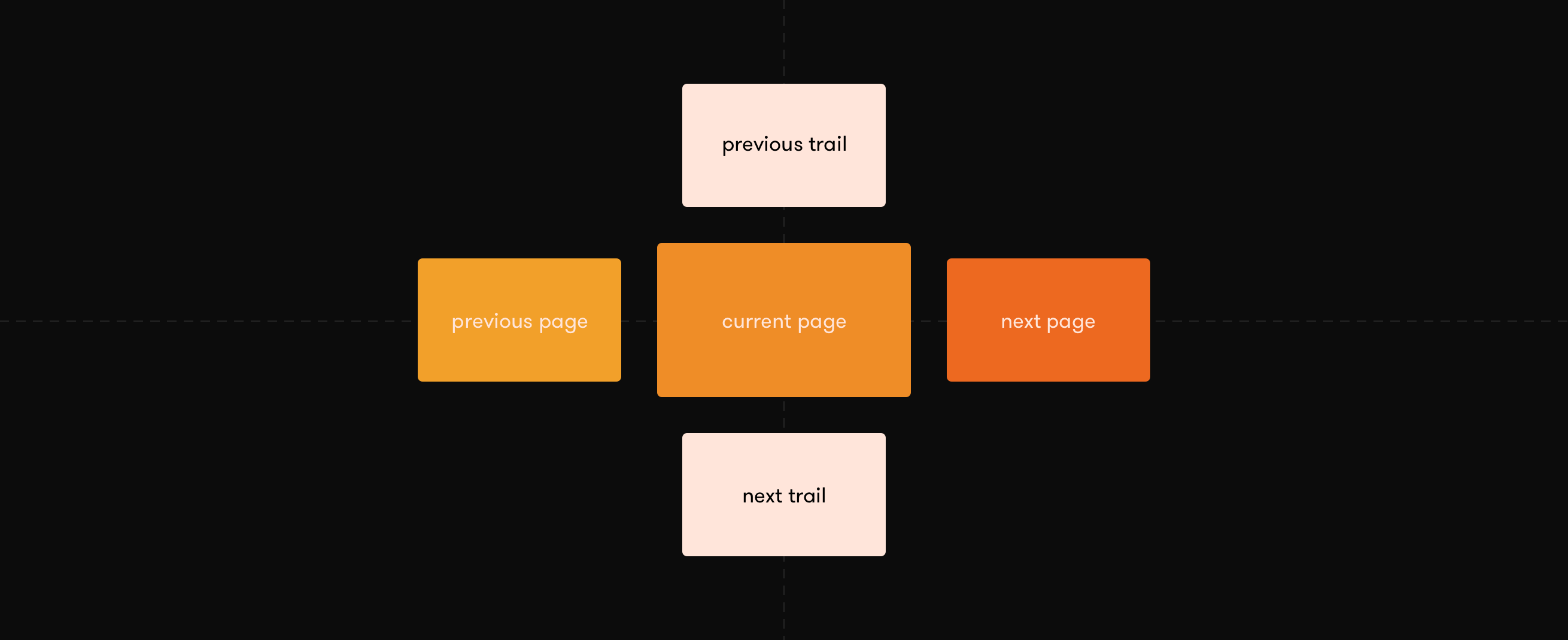
The spatial model is communicated through user interactions and animations to help user navigate the web efficiently.

Going back and forward.
Even with conventionally lossy navigation history, it’s common to have multiple entries to go backward or forward. Introducing trails will only increase the number of entries.
Read more
Familiar feeling
Horizontal movement is a common interaction for choosing arbitary point on the timeline.

Gyroscope
I was prototyping possible solutions of utilising gyroscope to show additional context.

Go back
Swipe from the left allows the user to take a peek at the last history entry. Pulling further unfolds the full trail and reveals the entire history.

Contextual
Pulling past all of the entries switches to a trails overview, as we assume the user wanted to switch to a different website.
Josh Carpenter
@joshcarpenterUX Lead, WebVR/AR at Google.
More people should know about Browser.html. Way too modest a team. New browser on new engine doesn't happen often.


